TACOBANANA


x
The Unemployed came to TacoBanana looking for something very clear: bolder communication .
They wanted to evolve from a basic image to a more daring presence, without losing the Mexican essence that characterizes them.
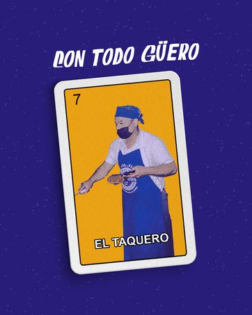
The first step was a complete rebranding , with a more powerful visual identity, visually appealing and aligned with its personality .
The new graphic and content line was designed not only to connect with current consumers, but also to attract new generations looking for brands with character and/or a unique approach.
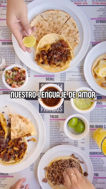
The new style was applied to reels, photographs, and graphics designed to generate appetite ; to physical menus and printed materials placed at points of sale; and to outdoor advertising (OOH) in key areas.
We also worked on a clear structure for their Instagram highlights, focused on enhancing their delivery channel .
Once this channel was developed, we designed a specific rebranding for home delivery packaging , seeking not only functionality but also brand recall through the packaging experience.
The new packaging reinforced the branding, created a connection with consumers, and positioned the brand in a more competitive position within the food delivery world.
This case is an example of how a traditional brand can evolve without losing its essence, when communication is well-directed and visually executed.
Below is a sample of the work we have created together.


